Case study · 16
NeuroSoins
A care brand with a name that says what it does and a mark that says how. NeuroSoins brings neuroscience and care together, and needed an identity that reads as clinical and kind at once.
Deliverables
What we shipped.
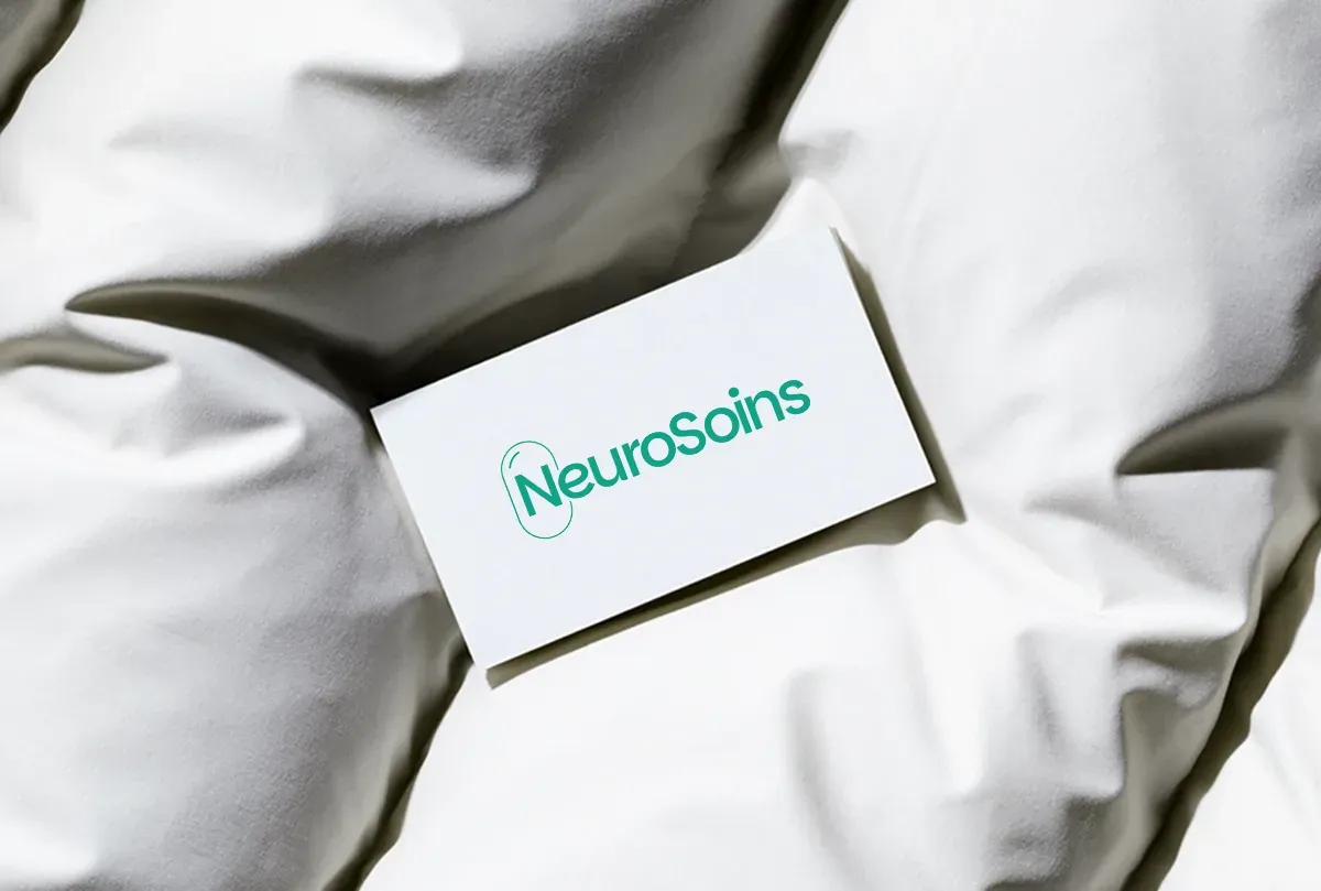
- Wordmark
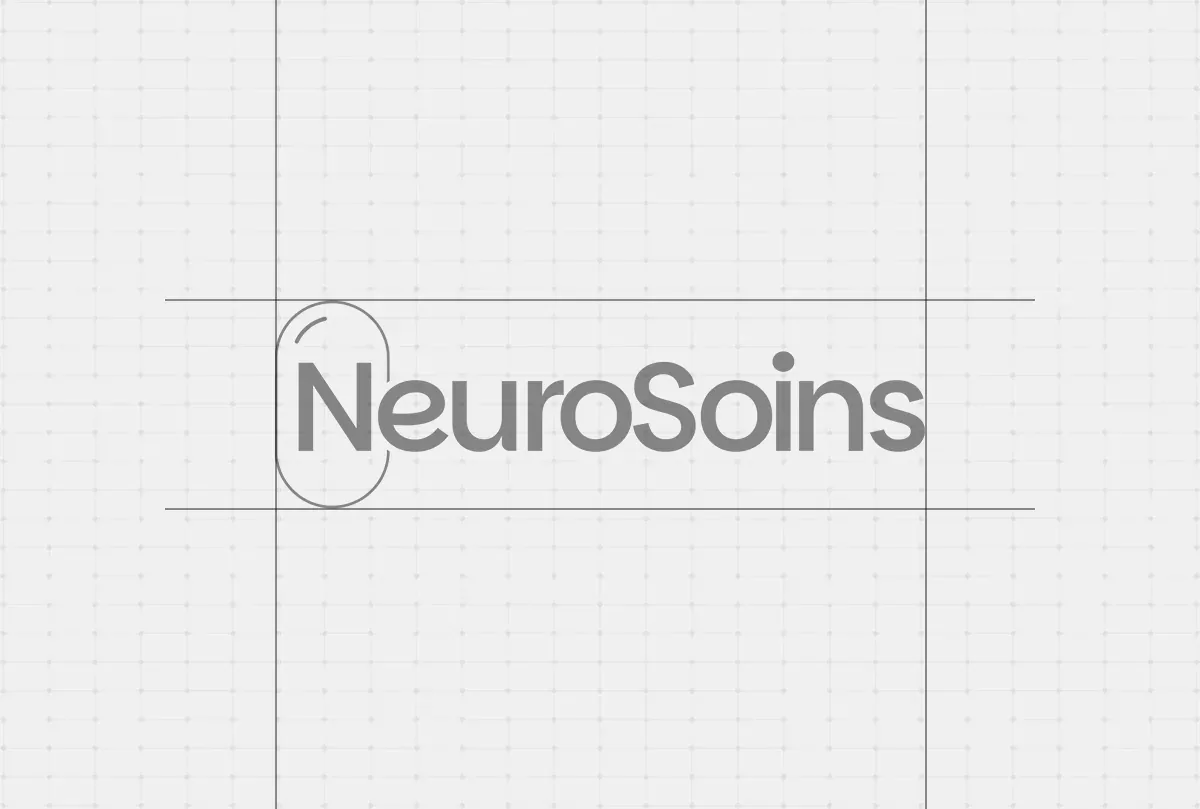
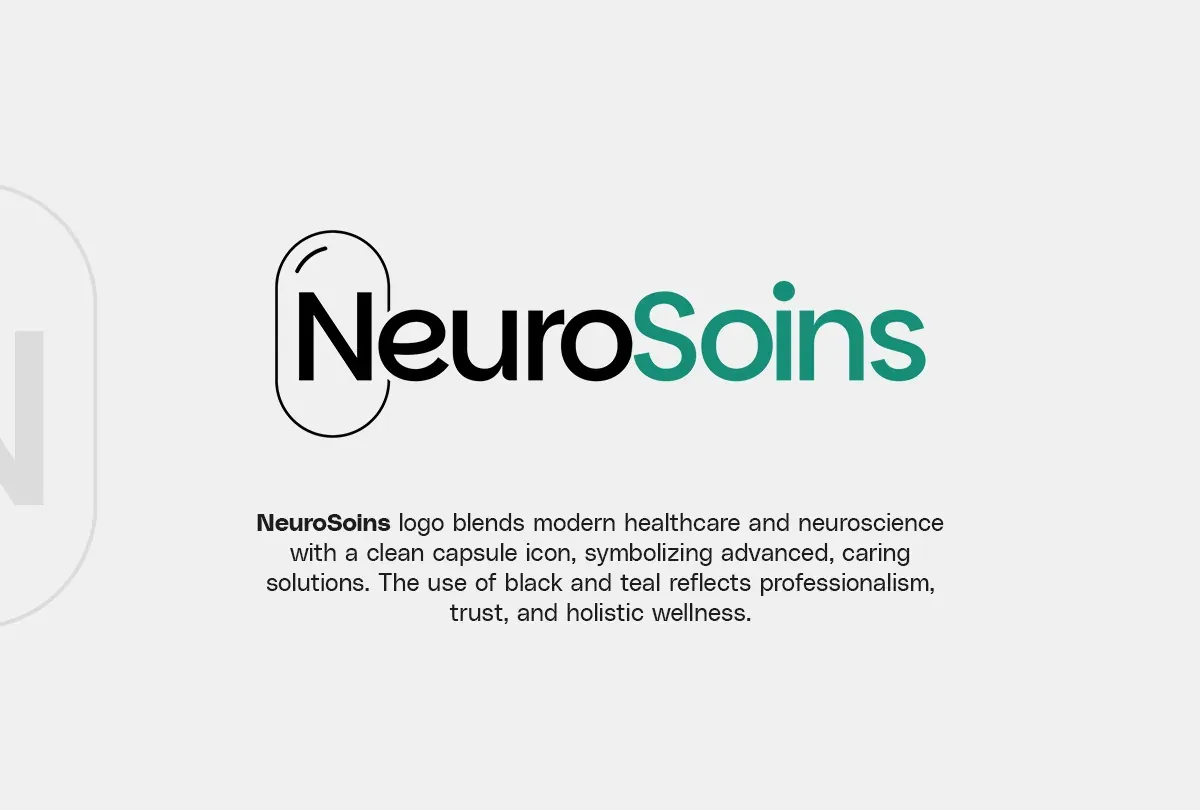
- NeuroSoins in black and teal, with a capsule drawn around the N
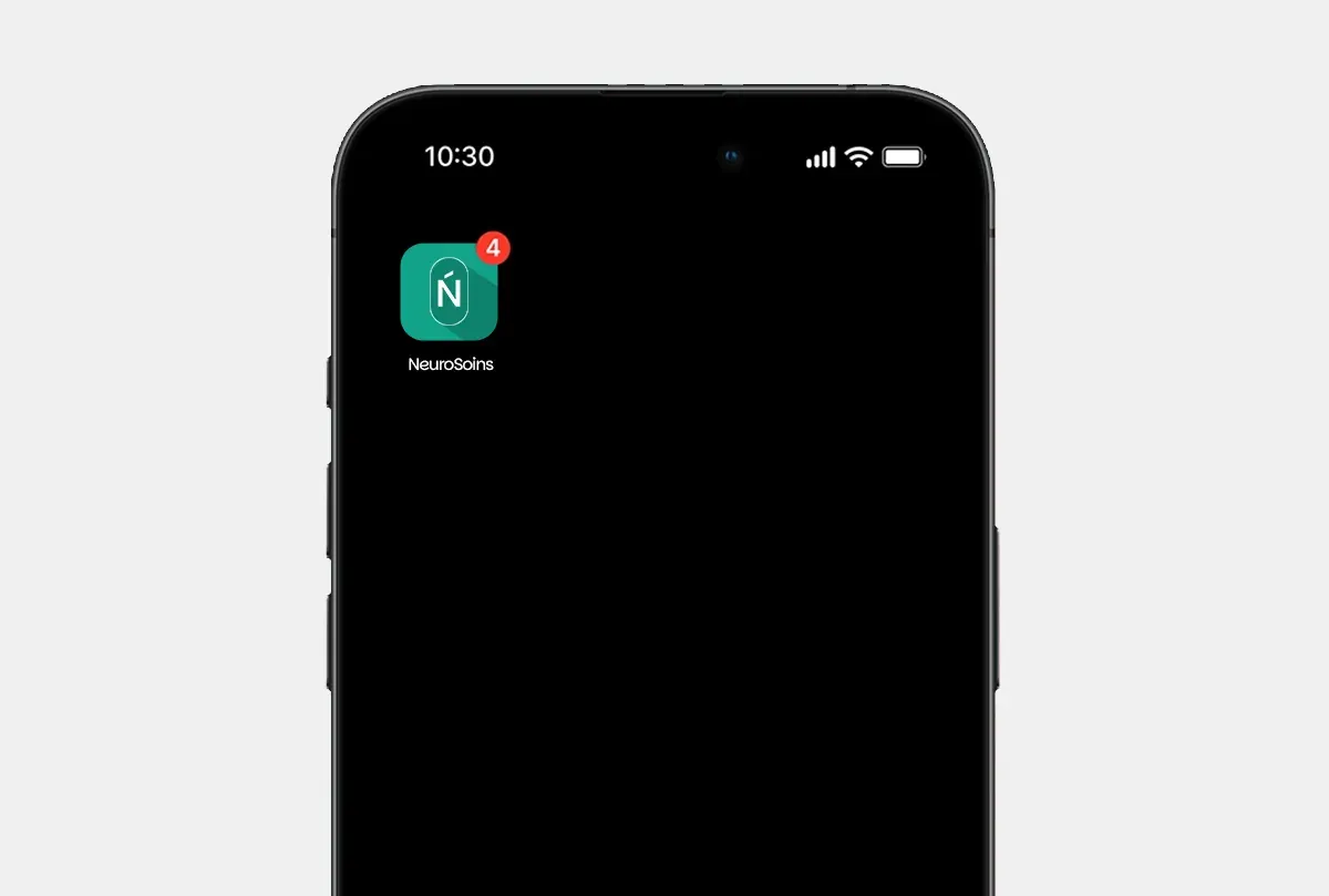
- Monograms
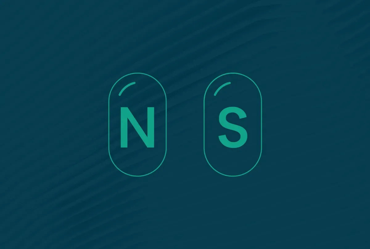
- N and S capsules for the small spaces
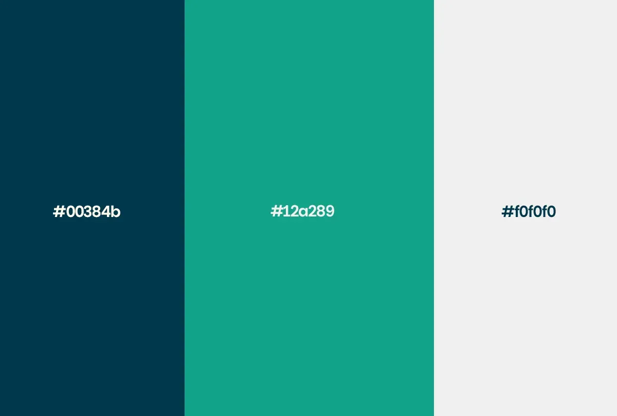
- Palette and typeface
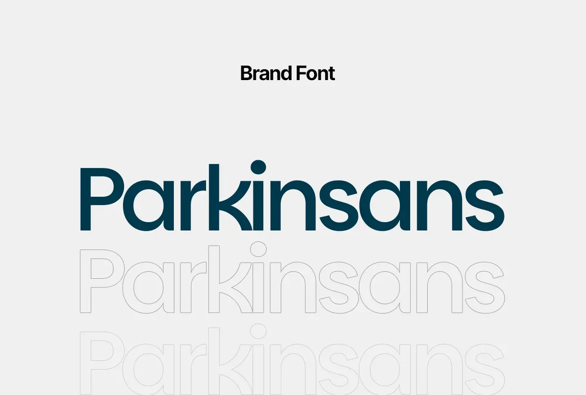
- Deep blue, teal and soft grey; Parkinsans
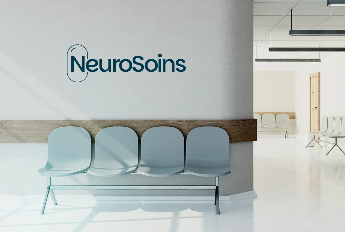
- Applications
- Business card, app icon, staff scrubs, clinic signage
NeuroSoins: the work, shipped