Case study · 04
Suds Bath and Body
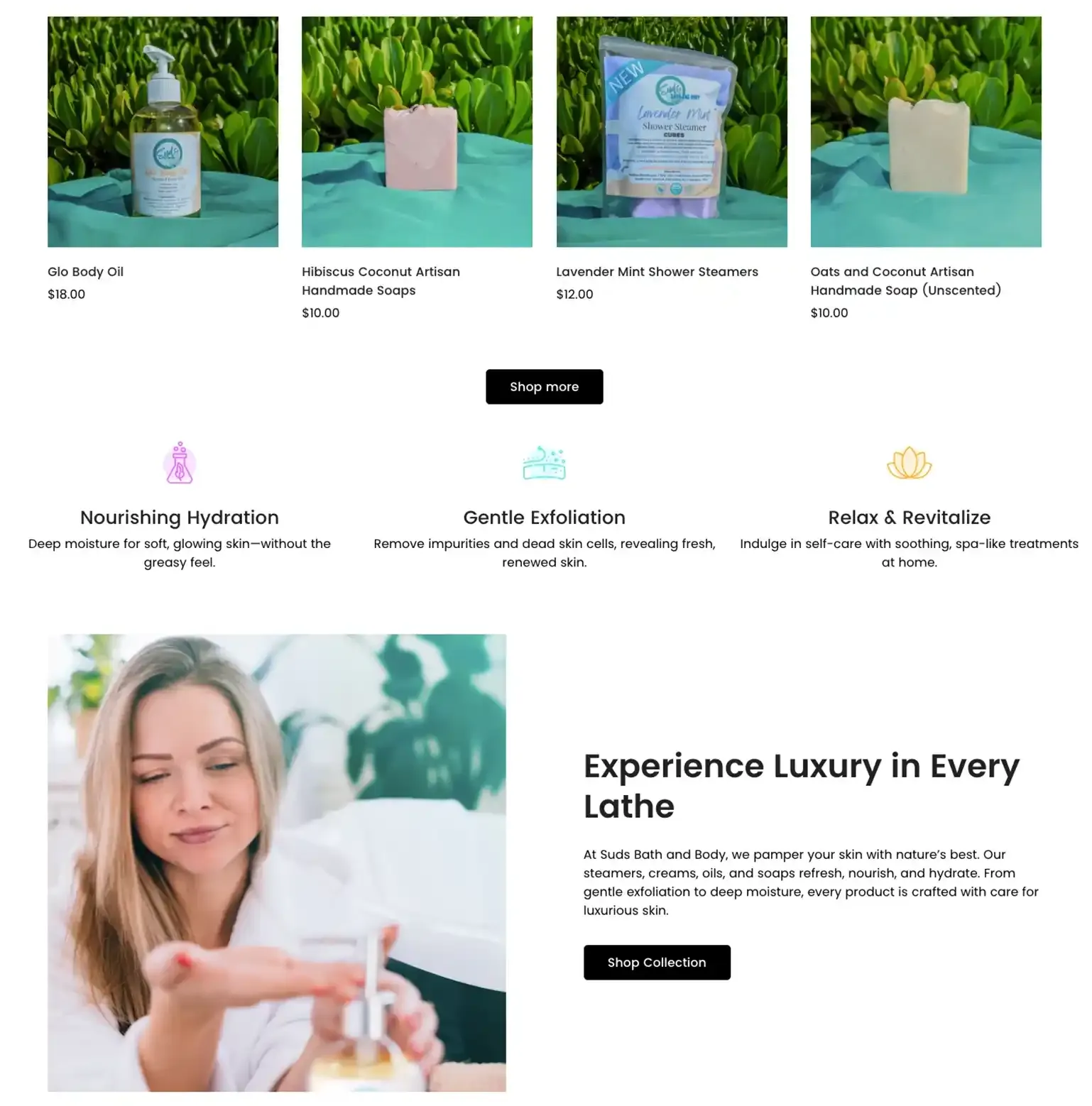
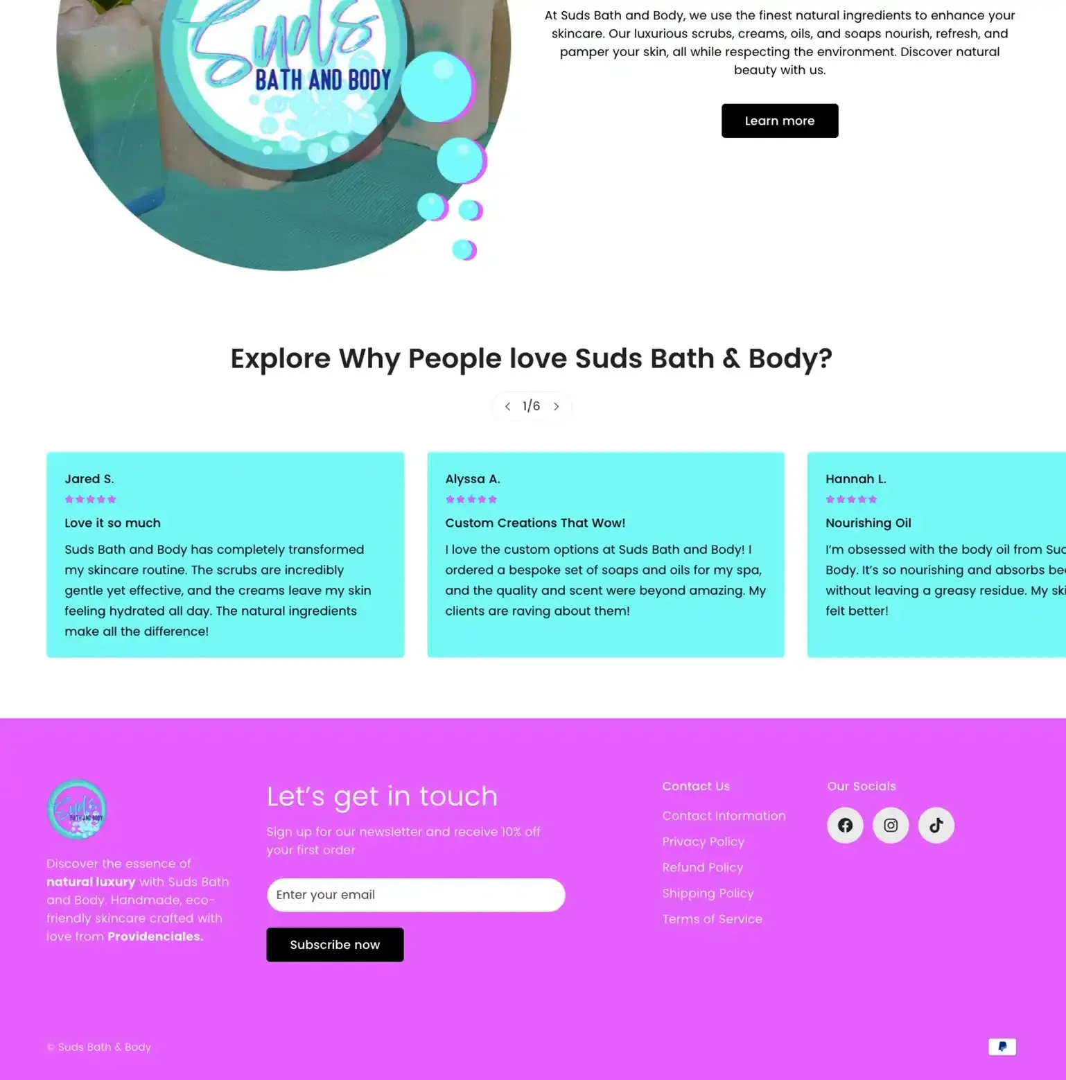
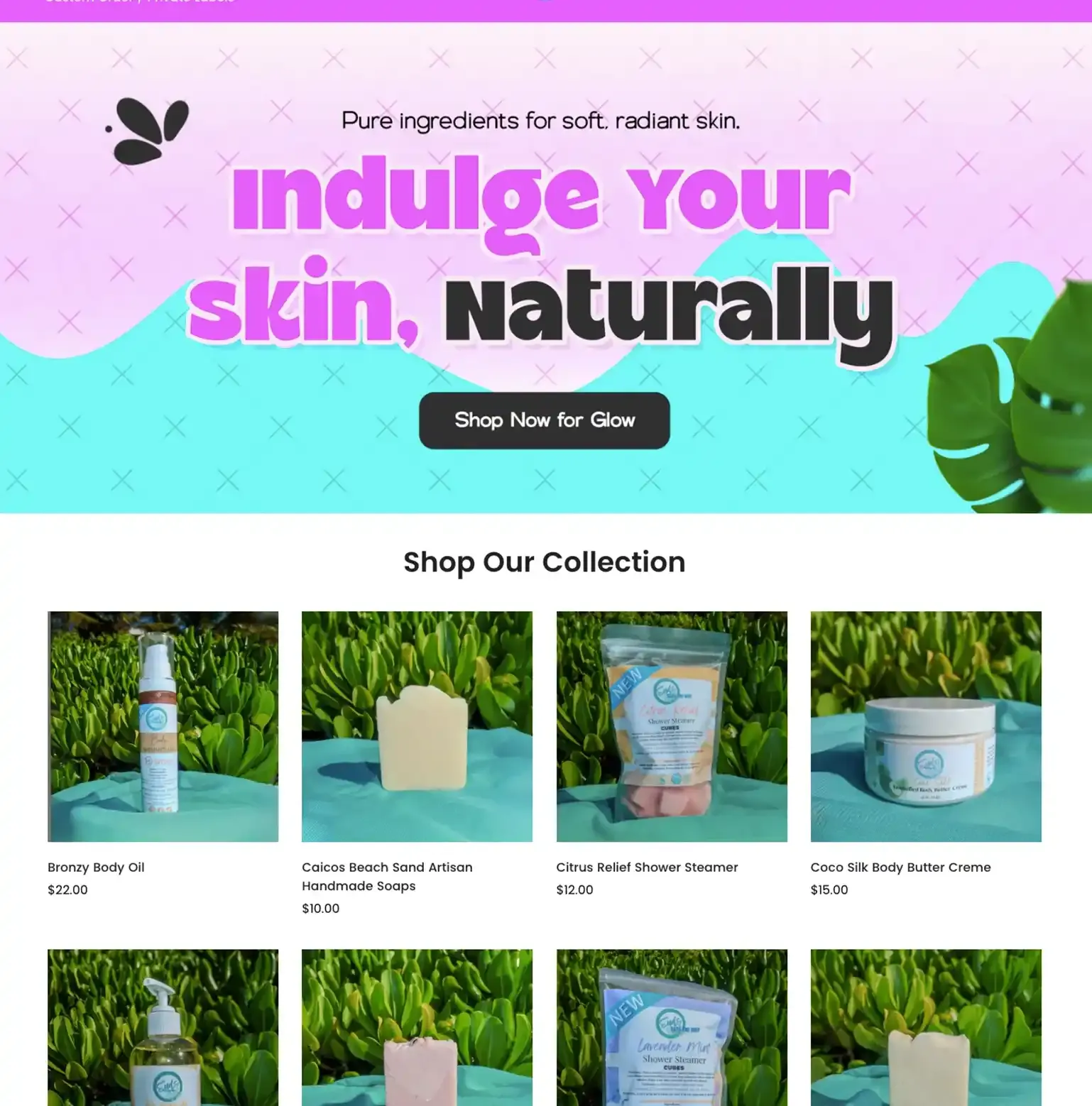
A new store, matched to a brand they already loved. Suds Bath and Body had a logo they were proud of, and a brand they didn't want to touch. What they wanted was a store that finally matched. Premium look, smooth shop, made to convert.
Deliverables
What we shipped.
- Shopify build
- Custom theme, mobile-first, performance-tuned
Suds Bath and Body: the work, shipped