Case 02 / October 2024 / BrandWebNew launch

Pulseo

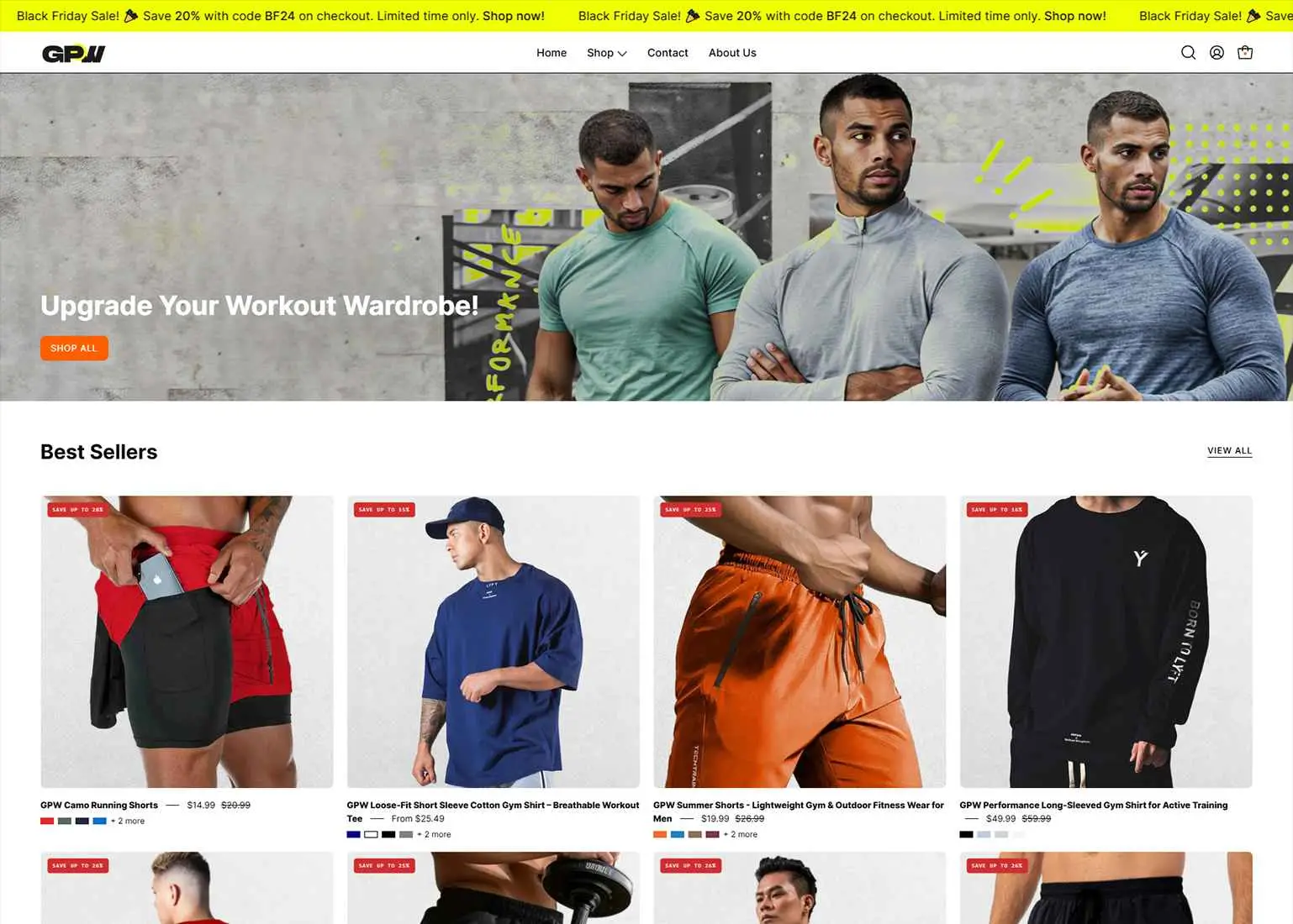
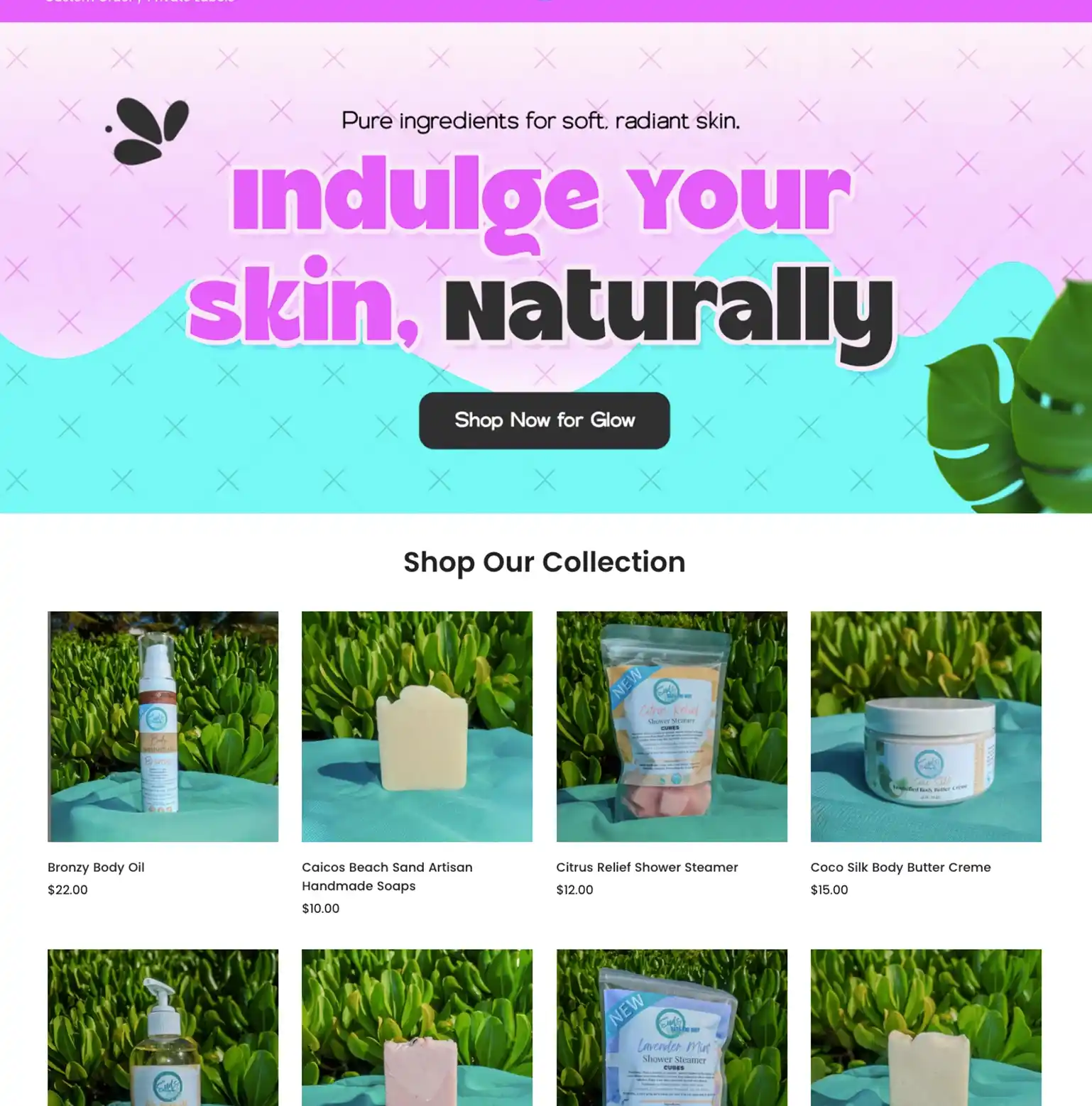
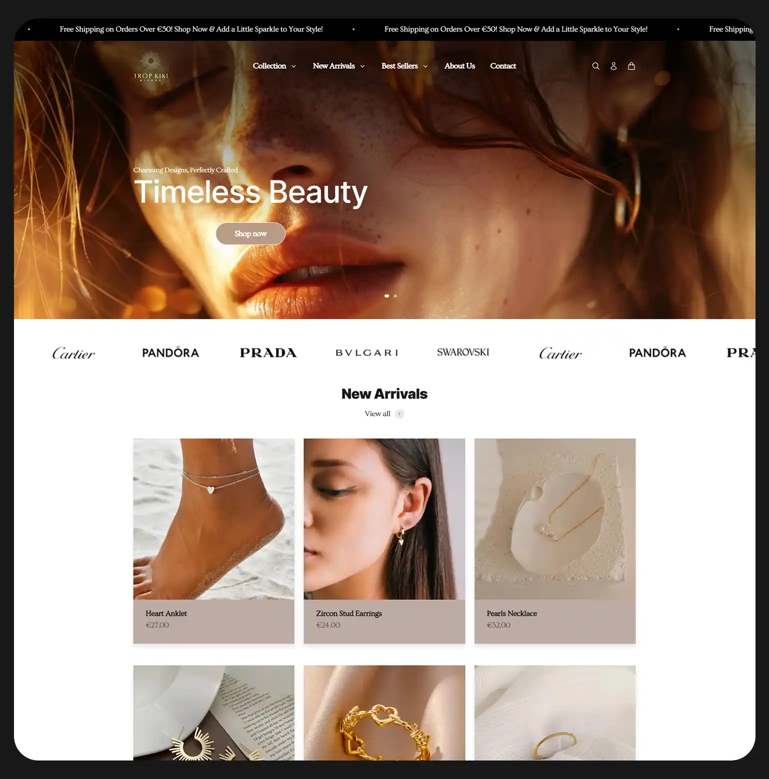
Recovery products, given a premium home.

ServicesBrand · Web
PlatformShopify
Year2024
Pulseo
01 The brief

Pulseo came to us with a brief and a high bar: launch a recovery and massage brand that didn't look like every other wellness store.

Logo, colours, voice, store, all from zero.

Origin New brand, new launch
02 What we shipped
Brand identityLogo, palette, voice, photography direction
Shopify buildCustom theme, mobile-first, performance-tuned
03 The work, shipped
04 Our approach
Move 01

Premium-feel.

Move 02

Editorial layout over a generic template.

05 Direction → build

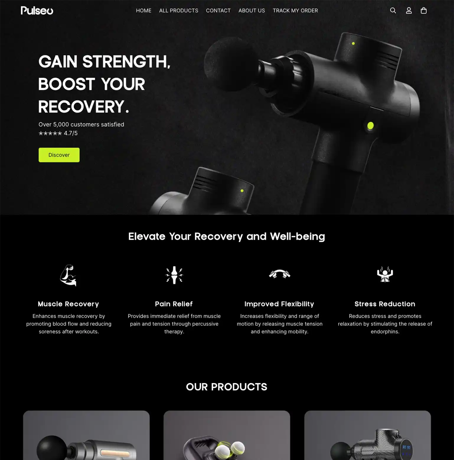
Direction first, build second. Logo, palette, then the store built on top.

Logo Drop in the logo lockup or wordmark.
01

Logo

Wordmark and mark, locked first.

Color palette Drop in the palette plate or swatch sheet.
02

Color palette

The colour system that runs through everything.

Pulseo build
03

Build delivered

The result, built on the brand.

06 What we built, in detail

Brand 4

Wordmark and mark
Colour and type system
Brand philosophy
Photography and styling notes

Build 4

Custom Shopify theme
Editorial PDP layout
Mobile-first responsive
Performance-tuned for Shopify
07 Brand system
PulseoRecovery · Premium
Palette
Ink#0C0B0A
Recovery Blue#A8C8F0
Slate#2A3540
Bone#F0EDE5
Type pairing
Aa
DisplayLora italic
Aa
BodyDM Sans
Voice
CalmPremiumConsidered

The brand tone, distilled into three words the team can hold to.

08 Closing note

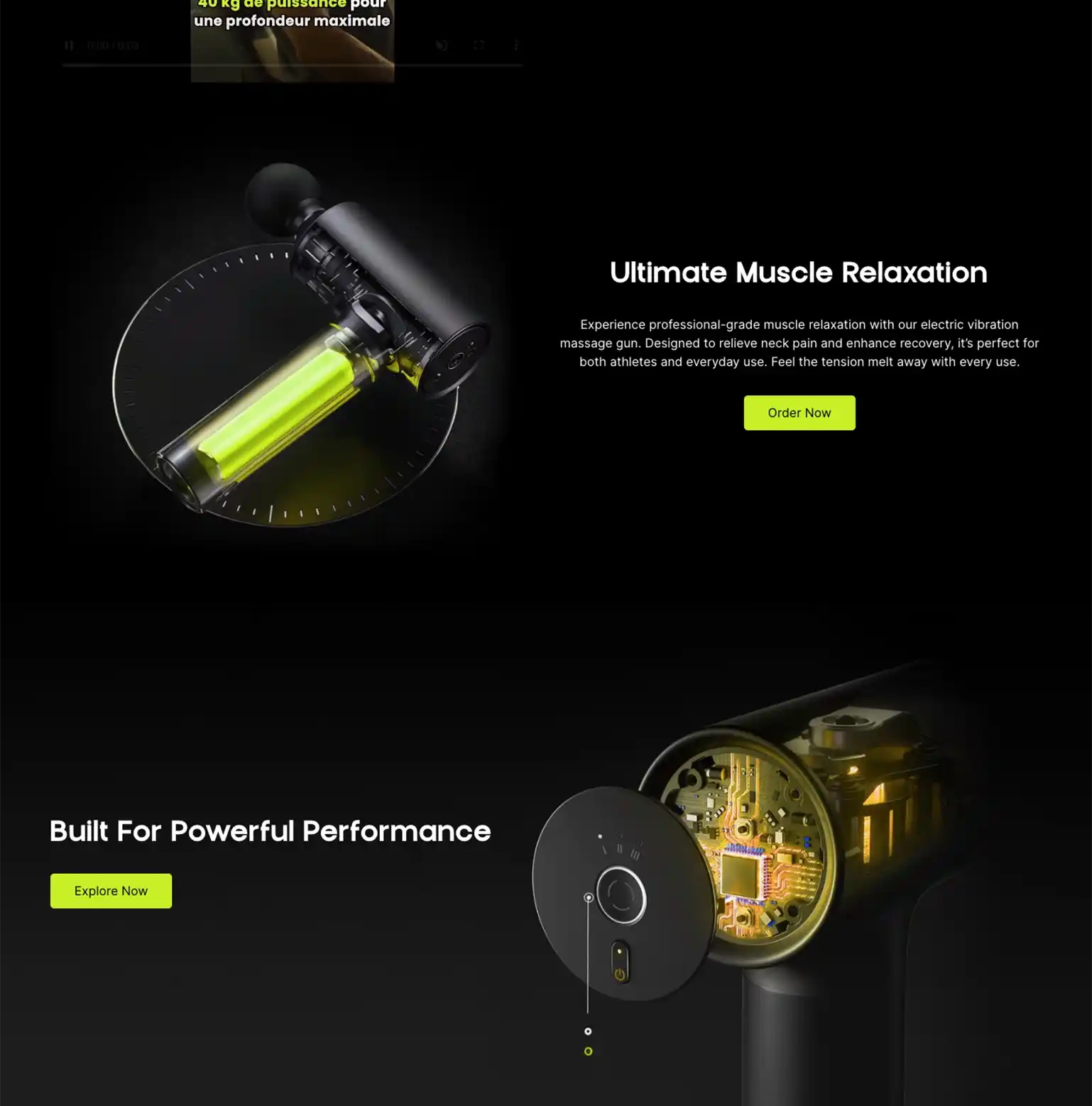
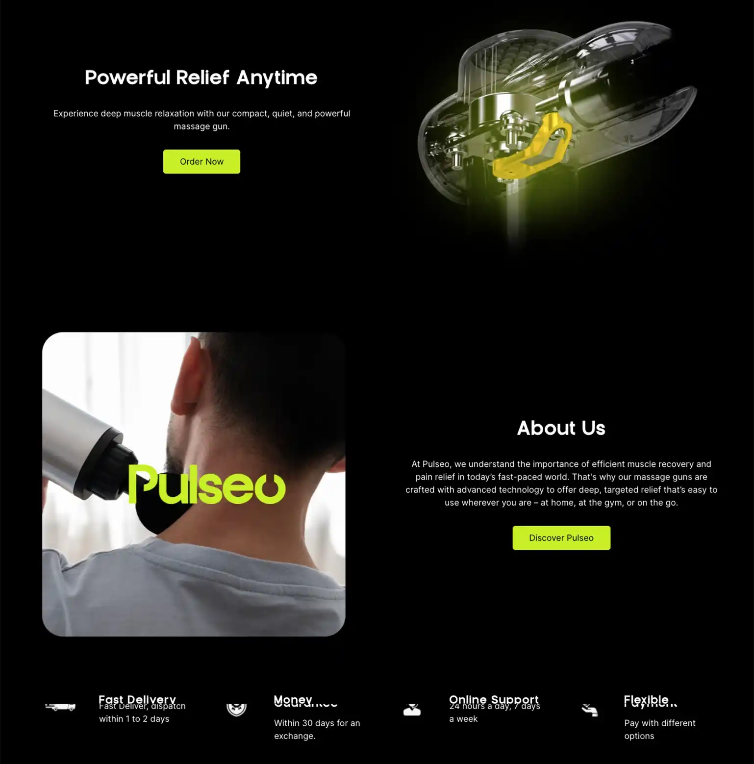
The client absolutely loved the premium feel.

Note: From the project team

Got a project like this?

Bring us yours. We reply within one working day.

Start a project